Approach
An effective design system solves boring, repeatable problems so that developers and designers can focus on more creative and challenging tasks.
Following the atomic design principles we've build into the system mostly ions, atoms and molecules at the beginning, we wanted to try and test new ideas in the product before incorporating them into the system. This approach helped us to stay away from the classic design system conundrum of being overly prescriptive and constraining.
Once a pattern or idea has been proven to be effective, reusable, and tested in edge cases, we can extract it from the product interfaces and add it to the design system.
Tooling
The frontend team chose Storybook as the tool for UI development, testing, and documentation, which worked well with Figma, the design team's choice.
I found this to be a good solution for both teams, as it allowed us to work in our respective areas of expertise. Developers could use Storybook to access tested components, mock API calls, and ready-to-use code, while designers could use Figma's assets library and detach components as needed to experiment with new ideas.
Overall, this setup enabled us to collaborate effectively and efficiently.
Results shots
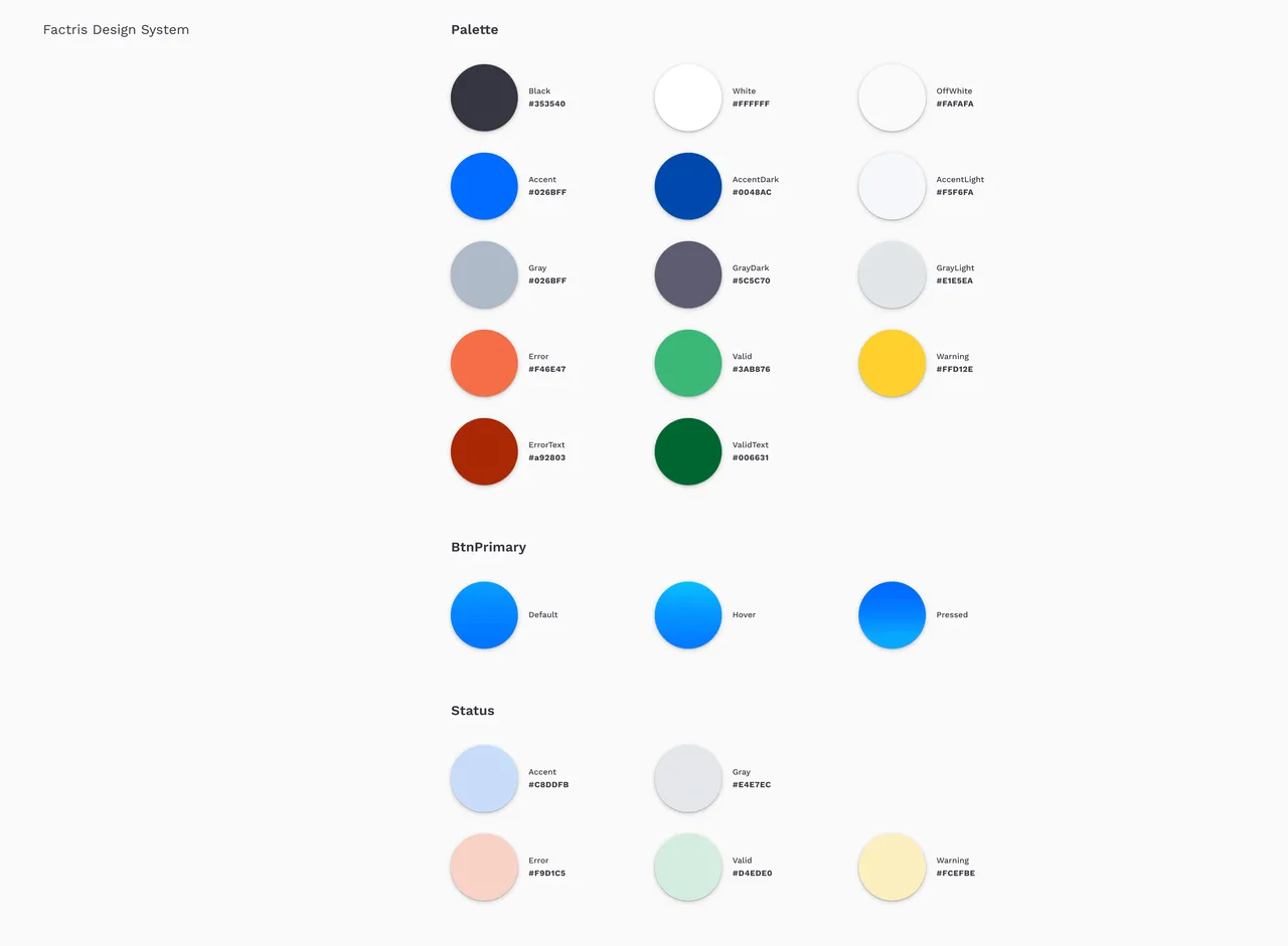
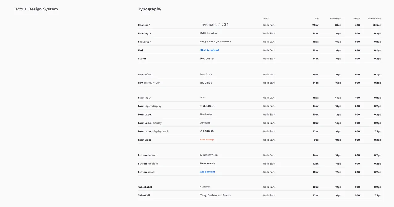
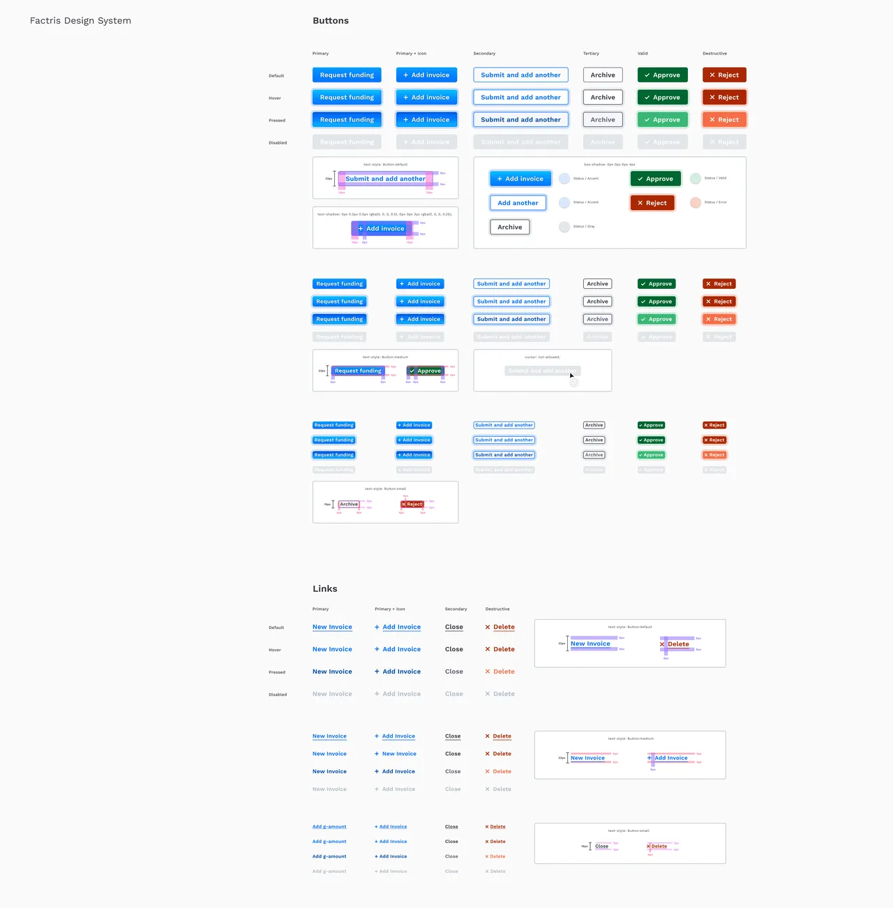
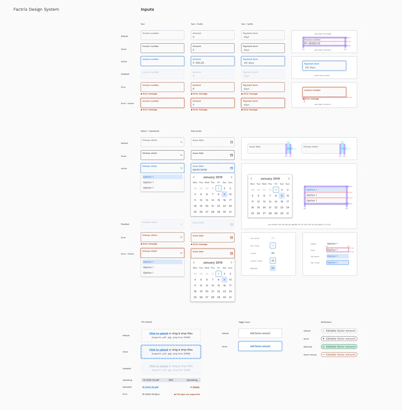
A series of stills from the initial design system launch featuring the main colors, fonts and input fields.
Conclusion
As a designer, it is essential to work closely with the front-end team, as the users of our products will interact with the production environment, not the beautifully crafted Figma prototype.
Building a design system is a step towards the goal of making our clients, and ultimately the end-users, happy. It has been shown that a well-designed and consistent design system leads to faster release cycles and better user experiences, as users appreciate predictability and consistency in the products they use.
Credits
Designed in Amsterdam from 2018 to 2021 as a full-time employee with Raju Maher (Frontend), Fatima (Frontend) and Melissa Pan (Design).